


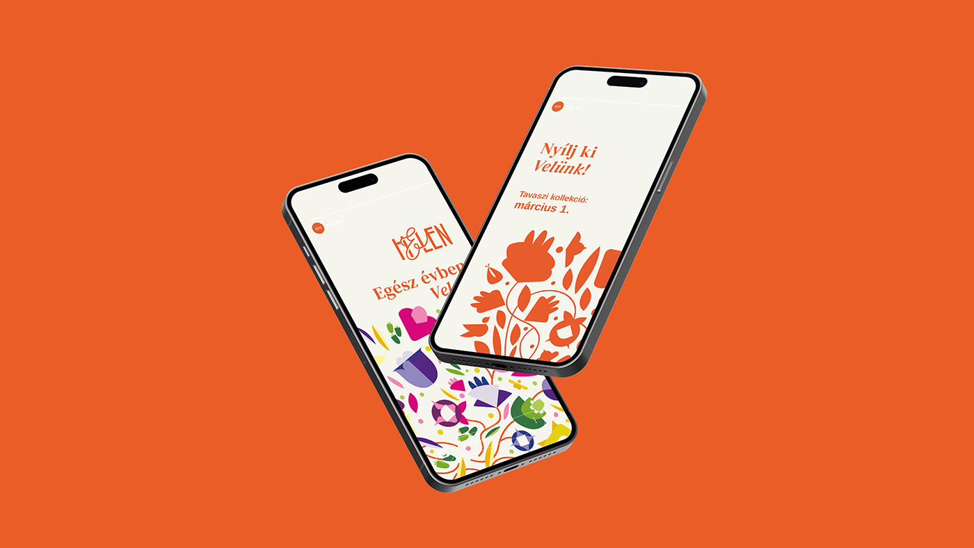
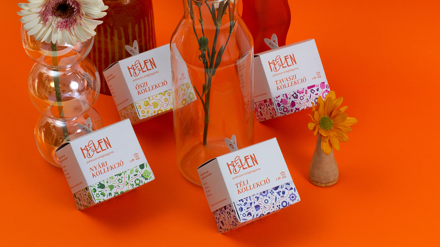
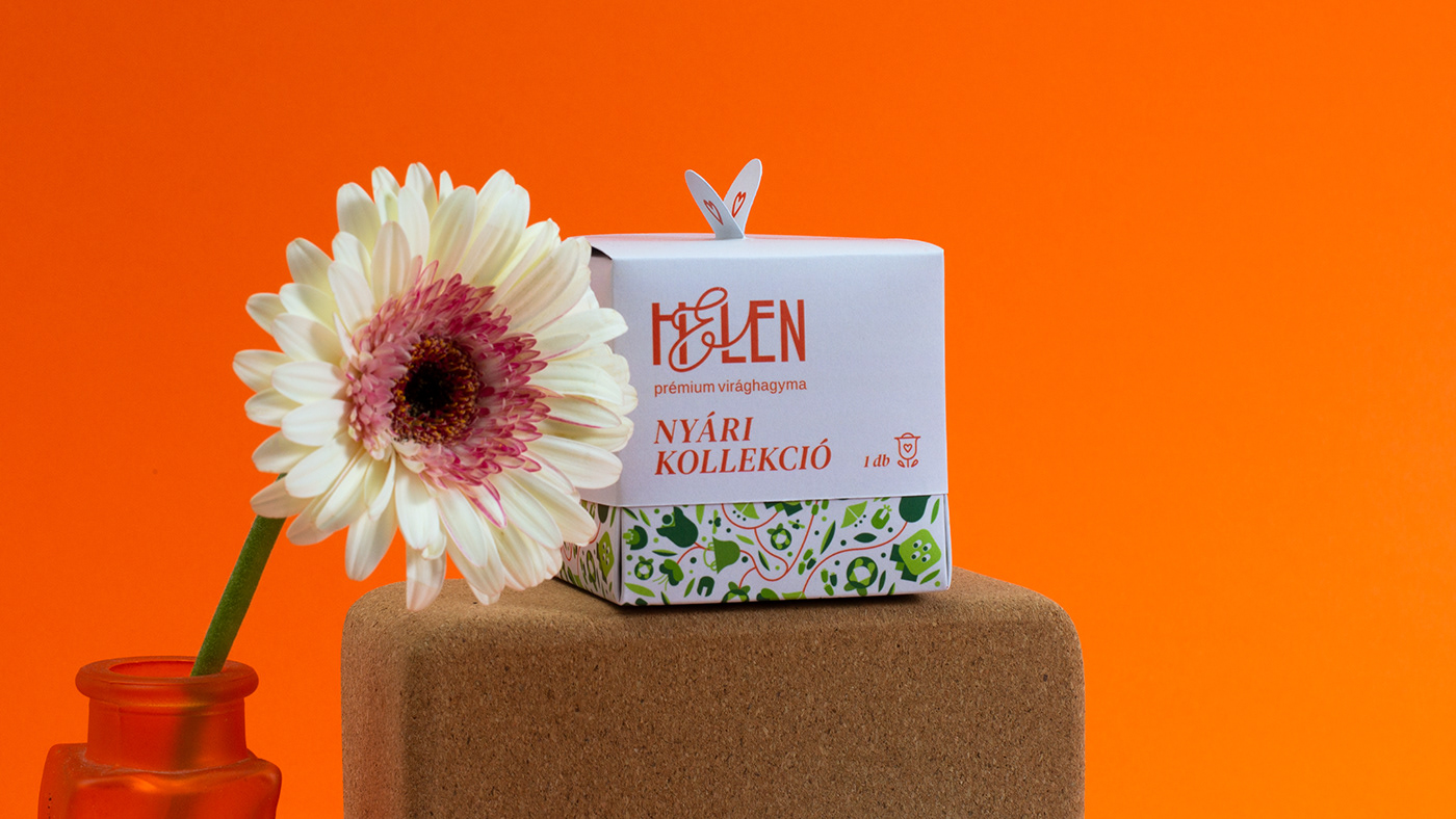
Helen is a premium quality, four seasons themed fictional Hungarian brand, which sells flower bulbs. The brand’s main message and purpose is to help people open up, grow and develop day to day, regardless the season, like their flowers. Helen offers seasonal flower bulbs through the whole year. They have four main products, which are available seasonally. The boxes always contain different flower bulbs, thereby maintaining the interest of costumers and promoting the constant renewal of the brand. The brand pays attention to the quality of the flowers and design equally. Its main messages are the following thoughts; Everyone deserves flowers all year round, regardless the occasion. Dare to open up to the World, so the World could open up to you.
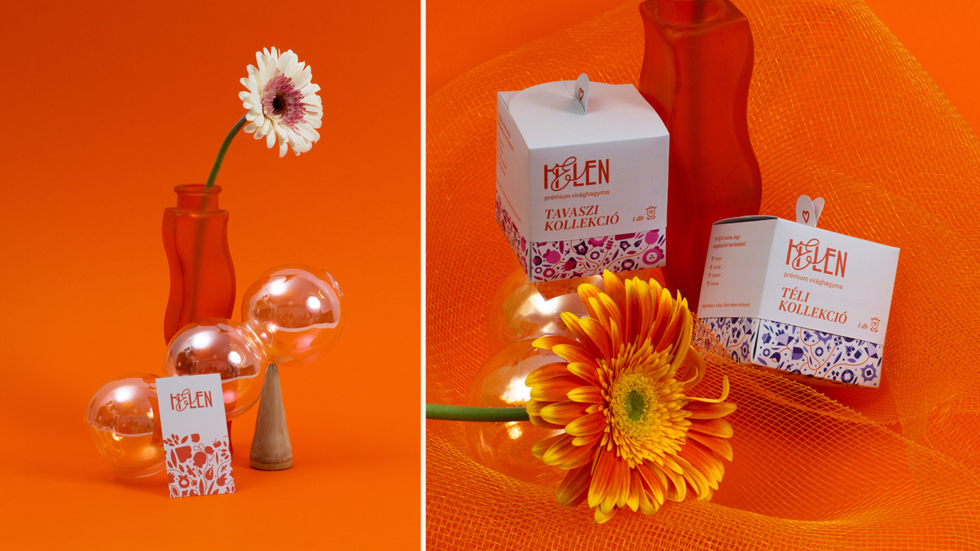
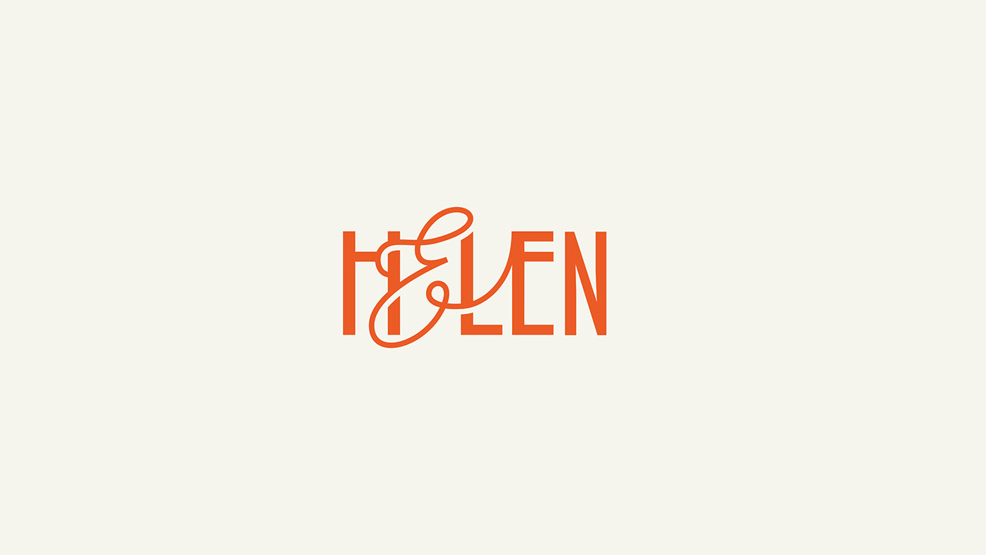
The logo reflects on the brand’s message, in a way that letter E “opens up”, symbolizing development and the will to develop. The two main colors, orange and beige make the customer easier to focus and relax. These colors appear on all the visual surfaces and unite all the platforms of the brand, like campaigns and the packages of the different seasons.


The structure of the packaging consists of two parts, a top and a bottom. When the top is removed the bottom part opens up, imitating the opening of the flowers. I designed the graphics of the packaging in a way that every season has its own flowers illustrated on them. The colors and the flowers are always changing, however the composition stays the same.


Thanks for watching!
@miha_panka
Consultant: Hollóka Grafikai Műhely, @holloka_grafikai_muhely, Budapest, Hungary
2023, Budapest, Hungary
@miha_panka
Consultant: Hollóka Grafikai Műhely, @holloka_grafikai_muhely, Budapest, Hungary
2023, Budapest, Hungary


